Inequality
Inequality is a broad multifaceted concept that is impossible to reduce to a single number or visualization; to understand it better, we must look at numerous perspectives (income, wealth, education, health, access to technology, and a multitude more). Below is just a single exploration: a snapshot in time comparing the distributions of individual incomes of people within countries and across the world.
You can skip to the interactive visualization, but you will get a richer picture of the data by reading the essay first.
The most important chart
In 2009 I came across a chart[1] that put the whole world in perspective. Here, a decade later, I recreate it with the most recent data I can find, from 2013[2]
[1]
Giving What We Can. The original chart was based on 2003 data.
https://www.givingwhatwecan.org
[2]
Tomas Hellebrandt and Paolo Mauro
https://piie.com/publications/working-papers/future-worldwide-income-distribution
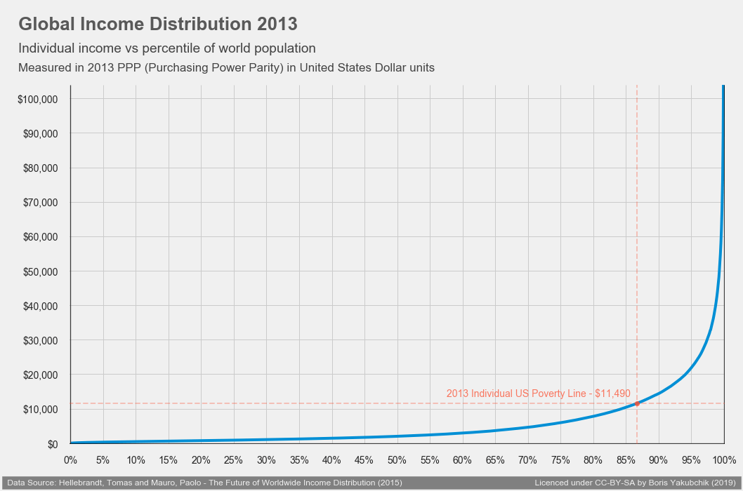
Figure 1 - Global Income Inequality
To understand it, you need to understand two concepts: percentile and purchasing power parity (PPP).
If every individual on earth stands shoulder to shoulder next to each other ordered by height, the person who is taller than 90% of the others is said to be at the 90th percentile. In this graph imagine everyone standing shoulder to shoulder arranged by income.
Ordering everyone by income is a very challenging task. Simply converting currencies at international exchange rates fails to capture the complexity of life. In many countries same items are cheaper (you can buy a lot more bread in one country for $1 USD than in another). A better conversion factor is based on how much money it takes to buy a standard basket of goods (for example food necessities). This is the gist of purchasing power parity.
In this and all below charts, all $1 USD is equivalent to $1 PPP (roughly speaking, $1 PPP can buy an equivalent amount of food and other vital goods in the US as it can in China).
The data depicted comes from 2013 and paints a harrowing picture of the world: half the individuals earned less than $2,000 per year. Almost a third of the people had less than $1,000 to spend for the whole year, that's less than $3 per day on average!
There is some good news: every point on this graph is higher than it was a decade ago (though some individuals rearranged their order).
Data challenges
Data collection is challenging in numerous ways, and the process of aggregating and comparing incomes results in final measures that are inexact. Measurements may be collected as income or as consumption; since the graph includes all people on earth, parents' income is split evenly across dependents in a household; data from nearby years may be substituted when a year's data is not available; inflation might inflate or deflate some incomes; etc. For a further discussion and data source information see data sources and methodology[3].
[3] See the further reading for a longer discussion.
The takeaway is that we are not able to state precisely, for example, what amount the person exactly in the middle is earning. Nevertheless, the data is good enough to see general trends and to grasp a global picture.
Zooming in: Finding insights about the world from the data.
Around 2011, in America, "we are the 99%" became a slogan expressing frustration at the inequality between the richest 1% and the rest of the people in the United States. But looking at the 2013 data above, we see that earning more than $44,000 would place one in the top 1% of the world's income earners.
In 2013, the US poverty line for a single individual was $11,490. Meeting one's living needs on less than $1,000 per month is a demanding challenge. Unfortunately, this was the reality for about 86% of the world's population.
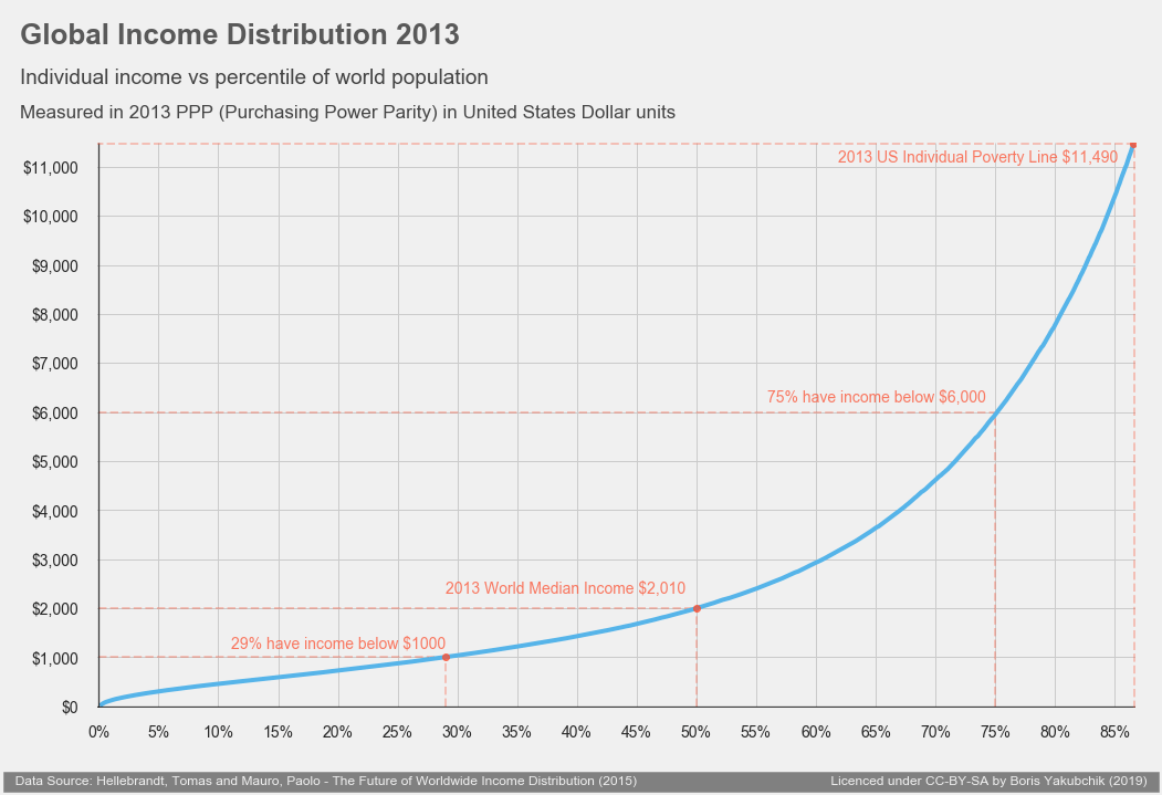
Figure 2 - below US poverty level
Another way to look at the data is to plot a histogram[4].
[4] To understand a historgram, imagine grouping individuals into categories, e.g. income groups in $100 increments, and drawing a vertical bar with the hight represenging the number of people in the group).
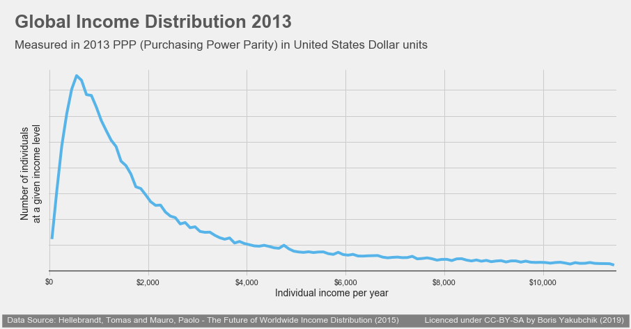
Figure 3 - Histogram of individuals earning less than $11,490
This visualization highlights that a large fraction of individuals are living below $2,000 per year.
Some takeaways:
- the incomes of people in the world are immensely unequal
- if everyone's income was equal, this graph would be a horizontal line
- if everyone's income differed by just 1 cent the line would be diagonal
- middle class individuals in developed countries like the US actually earn a higher income than 90% of the world's individuals; and many multiples of what half of the individuals on earth earn
- many people in the world live in serious absolute poverty, surviving on as little as a hundredth of the income of those in the developed nations' upper-middle class.[5]
[5]
80,000 Hours - How accurately does anyone know the global distribution of income?
https://80000hours.org/2017/04/how-accurately-does-anyone-know-the-global-distribution-of-income/
Comparing countries
Income inequality exists in all countries: simply comparing the averages (mean) or the middle (median) incomes of two countries tells us little about how the lowest or highest income earners are doing: we get a very shallow picture of life in those countries. Having data with income distribution from two countries allows us to compare an important feature of life within and between the countries in a more fine-grained way.
All charts below are generated from a dataset[6] compiled by Branko Milanovic, replicating his clever way of comparing across countries[7]. The data is of 106 countries where each country's population is split into 5% intervals and arranged by income.
[6]
Branko Milanovic - 2011 dataset
https://www.gc.cuny.edu/Page-Elements/Academics-Research-Centers-Initiatives/Centers-and-Institutes/Stone-Center-on-Socio-Economic-Inequality/Core-Faculty,-Team,-and-Affiliated-LIS-Scholars/Branko-Milanovic/Datasets
[7]
Branko Milanovic - Global Income Inequality
https://www.gc.cuny.edu/CUNY_GC/media/CUNY-Graduate-Center/PDF/Centers/LIS/Milanovic/papers/2007/soundings.pdf
Data processing:
The data the graphs are based on were collected 2009 - 2012; incomes were converted to PPP using 2011 data (from a separate dataset)[8], and plotted against the 2013 world income distribution from the first dataset [9].
[8]
World Bank
https://data.worldbank.org/indicator/PA.NUS.PPP
[9]
Tomas Hellebrandt and Paolo Mauro
https://piie.com/publications/working-papers/future-worldwide-income-distribution
The previously-mentioned data challenges still apply, so every graph should be understood as imprecise, especially comparing between countries. Nevertheless, the vast differences in income dwarf the imprecision that comes from all other factors. For example, let's see how Germany, Brazil, and India compare in terms of per-person income.
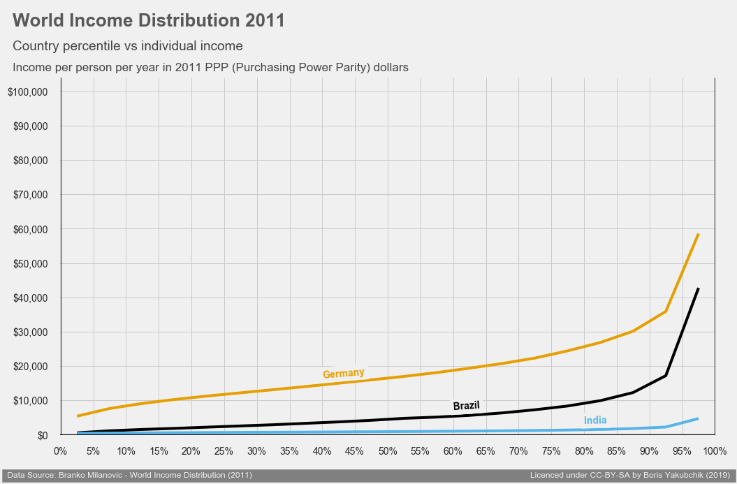
Figure 4 - Linear PPP income scale
Reading the graph we can approximate that about half of individuals living in Germany in 2011 earned more than $16,000 and about a quarter earned less than $11,490 (what is considered poverty in the US in 2013).
Please note that because the data contains averages for groups containing 5% of the population, the graphed line starts at 2.5% and ends at 97.5% of the population. We do not have enough data in this dataset to make claims about people outside of that range.
Because of income inequality, the vertical axis is mostly used to show the higher income country, making the lower income countries' distributions hard to decipher.
We will now re-scale the y-axis in a way that gives more room to lower income countries (to better see the distribution), and to focus less on the incomes of the very small fraction of the highest earners. Rather than using a logarithmic scale, the y-axis will be based on percentile from the first chart we saw.
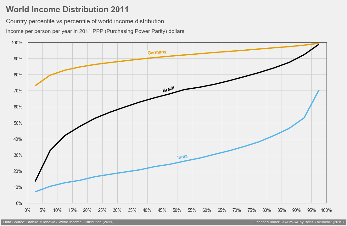
Figure 5 - Linear percentile income scale
We can now clearly see that the bottom income earners in Germany earn more than even the highest income earners in India. Additionally, thanks to re-scaling, the curve of Indian income distribution is more articulated. With data represented thus, we can infer, for example, that over 90% of individuals in Germany earn more than 80% of the individuals in the world. As for India, for example, only 10% of the income earners earn more than 50% of individuals in the world.
We now combine both, absolute PPP dollar measure of income with the percentile data:
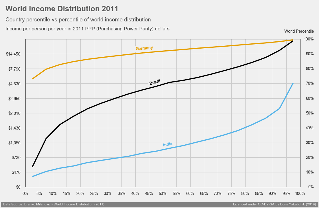
Figure 6 - Linear percentile income scale along with equivalent (non-linear) PPP
We see on the y-axis that the scale is linear with respect to percentiles, it is not linear with respect to absolute income. For ease of reading and comparison, we will keep the scale linear with respect to percentiles, but will choose several dollar values to indicate on the y-axis:
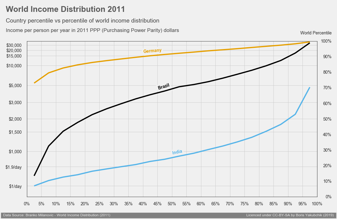
Figure 7 - Linear percentile income scale, non-linear PPP (specific amounts chosen)
This is hopefully the clearest way to present this very dense information. There are 107 countries in the dataset so here's a graph of all of them at once.
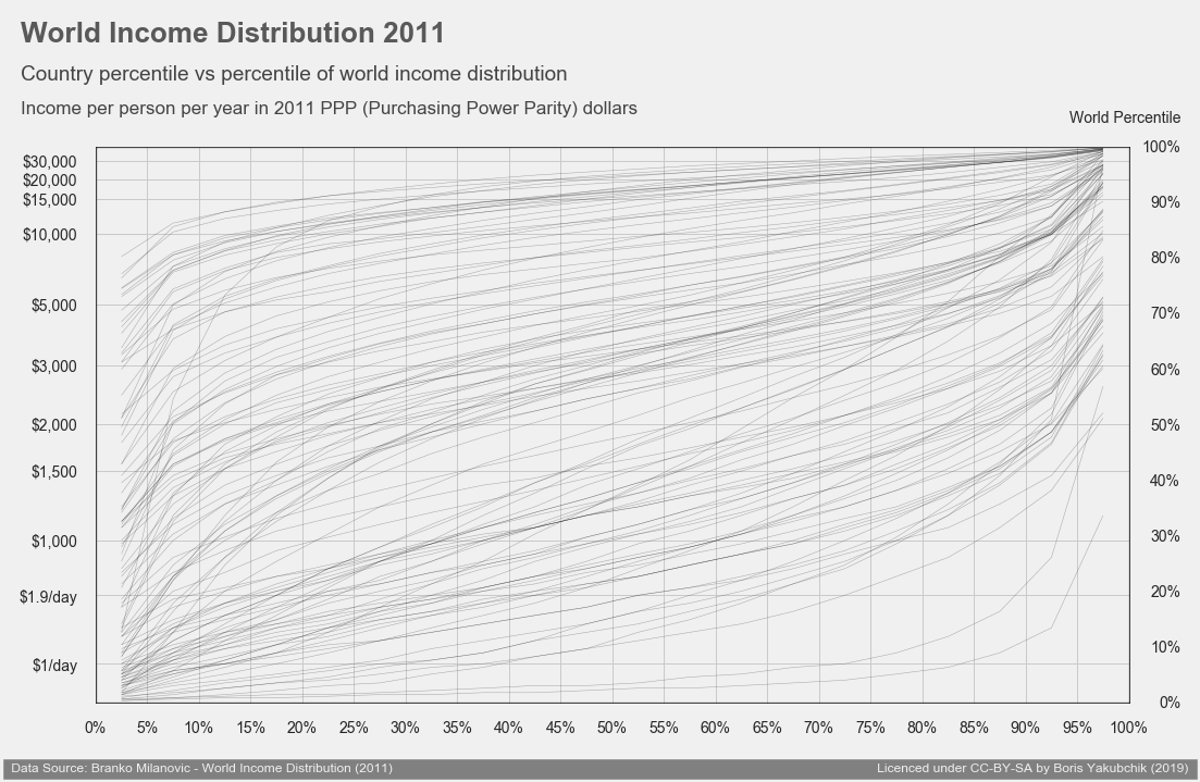
Figure 8 - All 106 countries from the dataset
This chart confirms what the late Hans Rosling was trying to educate the world about: the world isn't split into "developed" and "developing" nations, but is instead a continuum.[10]
[10]
TED.com - Hans Rosling shatters the myth of “developed” versus “developing” nations
https://blog.ted.com/hans-rosling-shatters-the-myth-of-developed-versus-developing-nations/
I hope you find eye-opening insights about our world as you explore the dataset below.
Interactive chart
Data from 106 countries in 2011 showing the distributions of incomes (averages of 5% fractiles) compared via 2011 PPP conversion. Map, legend, and buttons are clickable. Maximum 8 countries per comparison. Right-click for option to save the generated chart.
